Finde
A website that makes planning social hang outs with friends more efficient and less stressful for students.
UI Design @ Columbia University
Project Summary
Hanging out with friends is a way of finding balance in students’ lives and maintaining better mental health, but the current process of making social plans is complicated and difficult when it comes to coordinating availability, quality communication, and optimizing logistics. This in turn, makes hanging out with friends feel more stressful, frustrating, burdensome, and like a chore.
As part of a semester-long project for UI Design at Columbia University, my team created Finde as a solution to help promote social connectivity on campus with the goal of relieving stress and burden when making plans with friends.
Outcome
Finde is a website that aims to make planning social hang outs with friends easier and more streamlined. It is designed to be suited for groups ranging from 4-15 people where coordinating calendars and ideas for what to do and where to hang out becomes increasingly difficult and burdensome.
The app is simple and straightforward and takes the plan decision making out of students’ hands so that they can focus on other, more urgent needs.
Timeline
September - December 2024
Team
Alexandra Baril, Allison Zhang, Ly Na Nguyen
Key Skills and Methods
Contextual Inquiry, Affinity Diagramming, Journey Mapping, Storyboarding, Prototyping, Web Development
Tools
Figma, Excel, Google Forms, Balsamiq, Flask, HTML, CSS, React
↓ Continue to learn more ↓
Project Overview
My team’s project had 6 key phases:
1 2 3 4 5 6
Understanding the Problem
In order to identify the difficulties of making plans with friends, we conducted contextual inquiries on our target user population, students, to understand their current methods for making plans, what works well, what is challenging, and what they desire to make their process easier.
We conducted a total of 5 interviews using two methods:
Shadowing
Cognitive Walkthroughs
-
We observed text message communications between groups of friends and asked a series of follow up questions to break down their thought processes and emotions during each phase of planning.
We also asked general questions about their planning habits and preferences, what worked well during their highlighted experience, and existing gaps in their current process.
-
We asked participants to recall a time where their plans did not follow through as planned. We asked them about their thought processes and emotions during each phase of planning and the aftermath.
We also asked more specific questions about alternative plan making processes and their general practices for making social plans.
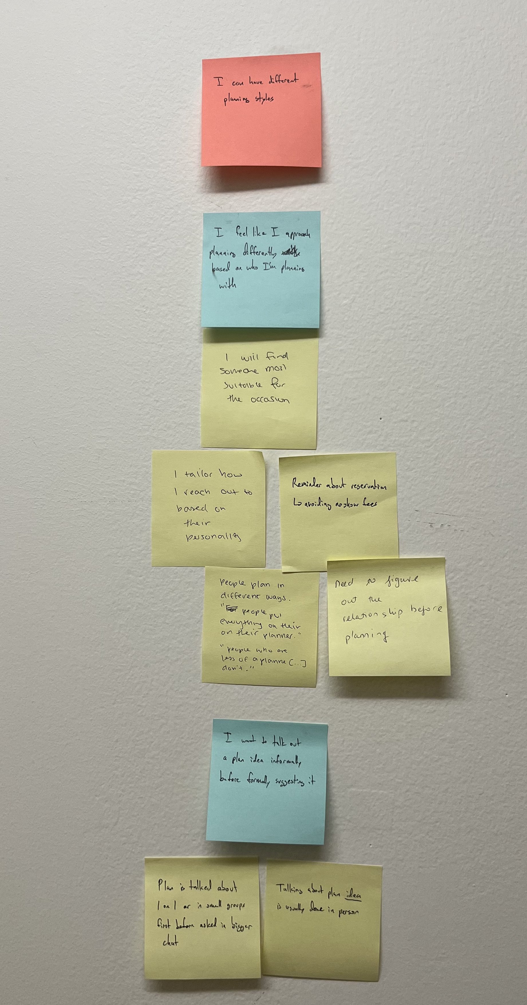
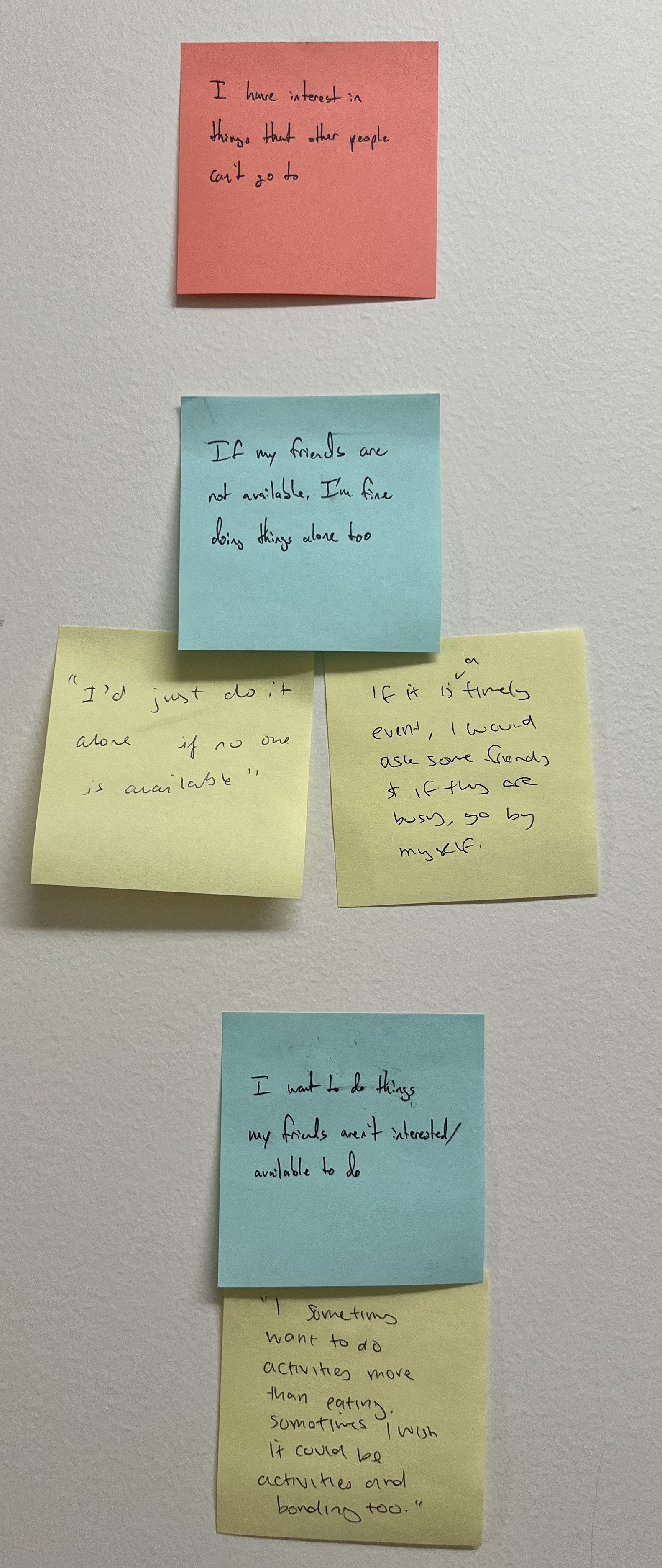
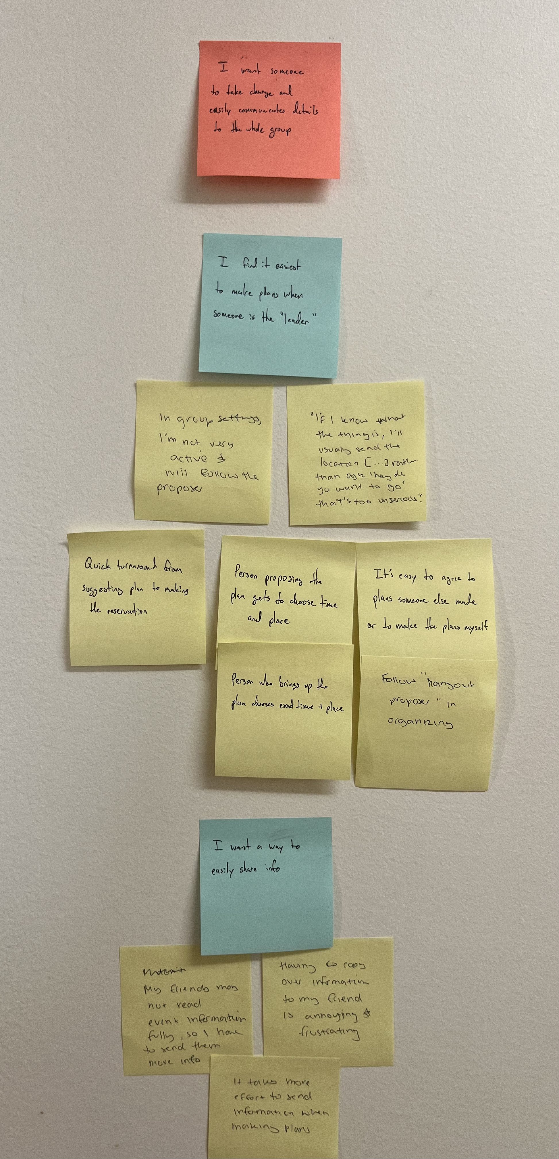
After conducting interviews, my group and I came together to synthesize our findings and organize them into different groups to identify larger trends within our data. This resulted in an affinity diagram that can be found below.

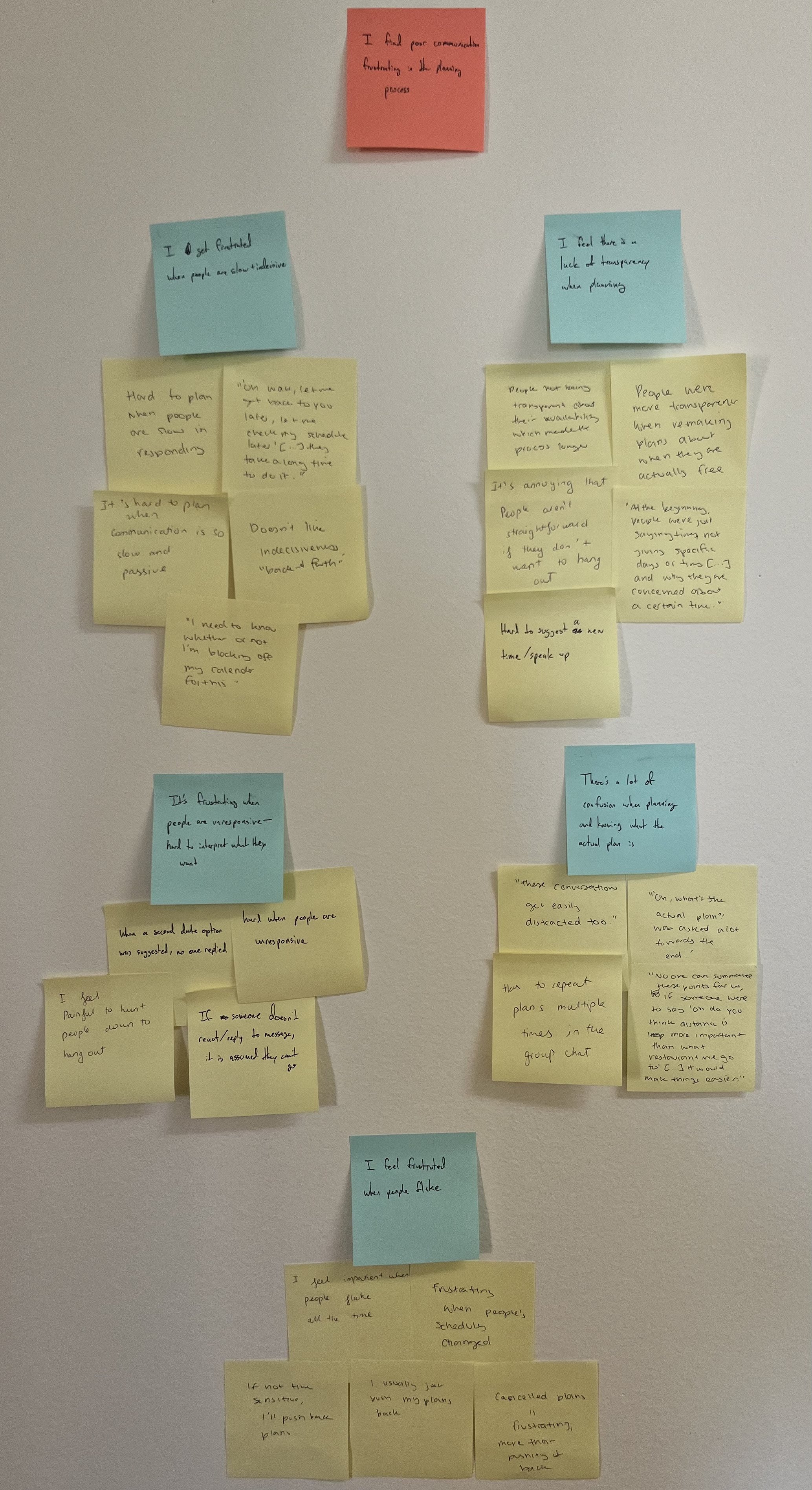
After compiling our affinity diagram, we crafted a journey map for our target user population and their current experiences making plans with friends to guide how we decide to design solutions.
Click below for the full journey map
In summary, we identified that
Everything is hard when it comes to planning social hang outs
This feeling is a result of conflicting planning styles, lack of effective communication, and disorganization. Students wanted a platform to help coordinate schedules, track people’s interests, and minimize the back-and-forth that often makes planning more time consuming and difficult.
1 2 3 4 5 6
Designing a Solution
The next phase of our project was to explore different design solutions for our users to help relieve the burdens that come with current methods of making plans with friends.
My teammates and I crafted our own storyboards of different unique design solutions to target our user population’s needs. Then, we discussed pros and cons for each board, focusing on whether the boards minimize challenges faced making plans with friends, as seen in our affinity diagram, and is feasible given the short timeline of the project.
Below is the idea that my team and I decided to pursue after discussion.
Once we finalized a design solution we wanted to explore, we conducted a comparative analysis on existing platforms that target similar user populations and have similar, yet different purposes.
We investigated Partiful, a platform that is most effective for larger social events such as birthday parties, with the goal of helping “foster friendships through social events” and When2Meet, a platform commonly used by our target user population for meetings and other more formal purposes because of its ability to visualize and find a time that accommodates various schedules.
We ultimately discovered that there was a gap between these two platforms in having a tool to plan social hangouts for smaller groups of friends that helps coordinate calendars and activity interests. This helped us determine that there was a bridge our platform could build between these two websites to make planning smaller get togethers easier.
Concept Testing
1 2 3 4 5 6
Before beginning to build a solution and creating prototypes, my team and I had to ensure that the design we had in mind is what users will use, receive well, and helps solves the problem at hand. In order to evaluate our current design solution, we conducted a smoke-and-mirrors prototype evaluation using Google Forms to simulate the user experience we aimed to create as closely as possible without building out a full prototype.
Evaluation Overview:
5 events planned
4 unique planners: individuals who want to make plans with their friends
15 other unique group members
Columbia University students
For the evaluation, we defined metrics for success in the following ways:
-
Assess user engagement and product success
This helped us evaluate if our product would benefit users’ daily lives, and if our product would solve a real user problem. By counting the number of plans completed, we were able to determine if our product was helpful for making plans and executing them without cancellation.
-
Track reliability and user commitment to plans
A major pain point of the plan making process that came from the contextual inquiries was “flakiness”, or people cancelling last minute. This metric helped us evaluate if our product facilitates the organization of plans and if the organization style makes it easier for people to commit to plans.
-
Capture user satisfaction and retention
This helped us evaluate and predict how often users would actually turn to our product for their social planning needs and how effective we would be at retaining users. This informed how we adjusted our app to better fit users’ needs and reflect the evolving landscape of social activities.
-
Assess usability and efficiency
One of our goals for this product was to minimize the time it takes to finalize plans with friends and decrease the “back-and-forth” that often comes with making plans. By tracking how long it takes for plans to finalize, we assessed the efficiency of our product and how well it resolves this pain point during the plan making process.
First, we had our 4 unique group planners customize a form to fit the hangout they wanted to schedule with their friends.
Then, they sent out the forms to their friends, which also included some evaluation questions about their experiences and our metrics for success, such as reusability.
After receiving the information from all participants, my team and I ran an algorithm that would select the most voted time and activity to finalize the group’s plan. If there was a tie, our algorithm would randomly select one of the tied options instead. We then sent the finalized plan via text message to the planners and their groups to inform them of what our platform has decided for them.
Lastly, we sent a follow up survey to the group planners after their scheduled hangout to collect data on our final metrics of success, such as plan completion, attendance, and time it took for plan finalization. We also sent out a final survey for everyone to fill out with a few final questions of interest from the team.
Key Takeaways
The experience helped streamline and make the plan making processes easier and faster
Users liked the algorithm and how it helped finalize their plans fairly
Users were willing to use this method again for making plans, but it felt too formal for casual hangouts because of existing mental models on using platforms like Google Forms
There was a need for a specification on location and submission deadline so that users have a better idea of the plans themselves and the timeline for knowing when those plans will be finalized
Users desired a way to centralize contact information for their group, especially when it is with a group of people they did not already have their contact information for
It felt tedious to have to enter activities when the group already knew where they wanted to go and what they wanted to do
With these findings, we identified that our existing design solution has the potential to be an effective tool for students to use to make plans with their friends with a few adjustments. We decided to implement some of this feedback directly into our design in the following ways:
Avoid Formality
Bright and colorful color palette
Casual and playful language
Location & Deadline
Option to input location separate from activities
Option to set a deadline for form submission
Contact Information
Place for group members to enter a phone number to receive text notifications from our platform on the final results
Predetermined Activities
Polling friends on activities and locations becomes optional
Prototyping
1 2 3 4 5 6
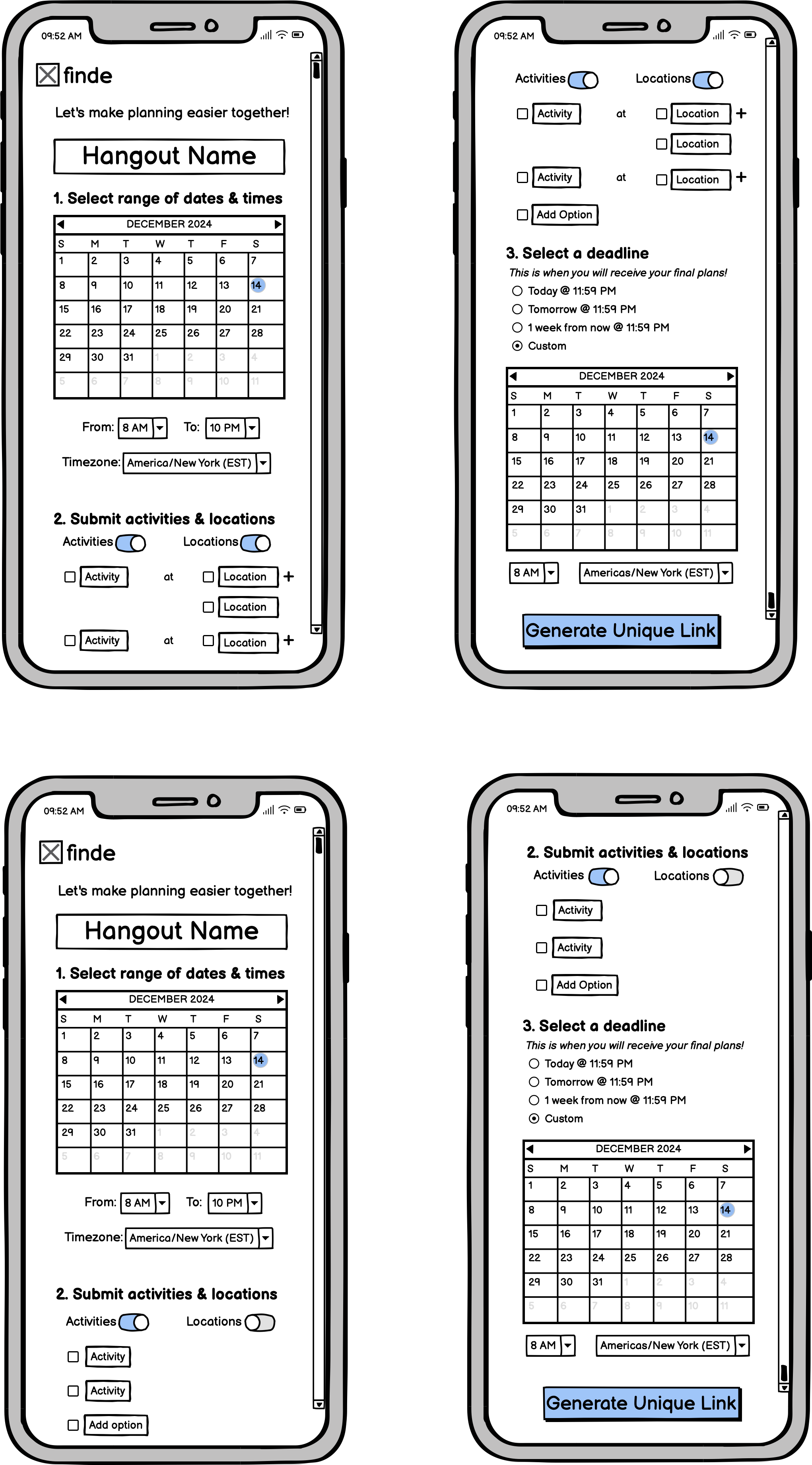
After getting a better idea of what users are looking for in a tool to help make planning easier with their friends, what is most important to consider to be unique from existing platforms, and what adjustments we wanted to make to our existing design solution, we created low fidelity prototypes using Balsamiq.
Our design has two main flows, one for a group planner or someone who wants to initiate plans, and group members, or those in group of friends the planner wants to hang out with.
The first 3 pages of the low-fidelity prototypes represent the group planner flow, and the 4th and 5th pages represent a group member flow (which includes the planner). The last page is a final results page that is displayed once our platform’s algorithm decides the group’s plans from their form submissions.
See the drop down menu for more details on our designed flow.
-
We noticed in our contextual inquiries that there tended to be a ‘leader’ to help organize the plans. Therefore, we created a unique flow for them.
Those who want to initiate plans with their friends will complete an empty form to distribute to the group. They can input a custom hangout name, dates and times to poll availabilities, activity and/or locations, and a deadline for submission.
They will then be provided with a unique link to share with their friends to submit their information.
-
All group members, including the planner will fill out this form. They will provide their phone number for text notifications, input their availabilities, and vote on a series of activities and/or locations unless that was predetermined outside of the platform.
-
Once all group members submit their form information and the deadline has passed, our algorithm will run on the data. The algorithm will:
Choose the time and activity/location pairing that has the most votes.
Randomly choose between the most popular options if there is a tie in votes.
Then all group members will receive a text with a link to view their final plan results the day after the deadline passes.
My team and I then started prototyping high fidelity mockups for the group member flow in Figma, as it was my team’s priority to implement that flow fully using HTML, CSS, React, and Flask. We also did mockups for the other submit pages as well.
Iterative Development
1 2 3 4 5 6
After completing high fidelity mock ups of the group member pages, we sent out a survey to our previous smoke-and-mirrors prototype evaluation participants to gather feedback on a few aspects of our design so far. This feedback was important to our team to ensure a few key aspects of our design were well received by our potential users and understand context for its use before continuing with high fidelity prototyping. We received a total of 6 responses.
We evaluated 4 key things:
1. Aesthetics
What do users like or dislike about the current aesthetics of the pages? (color, text, etc.)
2. Flow
What do users like or dislike about the current flow of the pages?
3. Use Cases
In what contexts would users use Finde?
4. Group Size Applications
For what sized groups would users use Finde for?
We evaluated the following three pages with users
Key Takeaways
Respondents liked the aesthetics of the page, noting specifically the color palette, visualizations, and the language used, such as “our algorithm is hard at work”
Respondents also liked the flow of the page, stating that it was clear and organized, and they especially liked the fact that the website told you when your plan details would be finalized.
We had mixed responses regarding the placement of the details of when the user would need to submit their form by. Some did not seem to mind it being at the bottom, one respondent wanted it to be sent via text message, and another respondent desired for it to be at the top of the page.
Respondents were more likely to use Finde for groups ranging from 4-15 people, with more emphasis on groups of 8-15 people.
Some noted that this platform works for medium to larger sized groups when responsiveness worsens or when coordinating schedules gets more complicated
Respondents are most likely to use Finde for planning hangouts with friends, but they also see themselves using it for parties, with some noting they will always use it for meetings.
Some noted that this platform could be especially helpful if you do not know the people you are meeting very well or when you need to determine what people are interested in doing.
“For club meeting or meeting for a school project, there is no need to know what activities the people are interested in [...] so I would use a groupchat or a when2meet. For hanging out with friends and a party, this platform would be useful in determining what people want to do and what the vibes are going to be like.”
Final Deliverable & Presentation
1 2 3 4 5 6
After getting a better understanding of where our product stands with potential users, my team and I made final adjustments to the Figma mockups and completed final prototypes for our platform. We also simultaneously worked on coding up the MVP using HTML/CSS, Flask, and React.
See below for a narrated walk through of our final prototypes and interactive MVP.
Future Work & Development
For future iterations and further development of this platform, our team would want to implement a few additional features, both in our prototypes and MVP, to build a more comprehensive product.
The following features would include:
Full privacy policy page, with all the legal requirements that would be necessary given the data collection aspect of the website
Restrictions on submission to prevent edge cases of empty inputs where input is would be required (e.g. phone number or activity voting)
Information page on what Finde is to provide extra context on its development, purpose, and more
Text message system to fully flesh out what the interaction would look like
Unfortunately due to time constraints, we were unable to fully implement all of these features
Additionally, future work would include conducting larger scale in-depth evaluations on developed prototypes to better capture user sentiment towards the platform as it currently is. In these larger scale evaluations, we could better assess usability and intuitiveness of the platform and better discuss various aspects of the platform with users if they are able to test it out.


